Three shops of various sizes cut paths to customer satisfaction.
It’s difficult to deny the beauty of the simple, clean-cut, straightforward marks of a routed sign. What’s harder to negate is your client’s request, no matter how complex, murky or circuitous. Whether putting router to wood or other materials that run the gamut from foam to HDU, and from metal to PVC, three companies recently proved again that no matter the material, what matters most is pleasing the client.
SAY YES TO THE SIGN
YESCO (Denver, CO) leapt at the chance to redesign, fabricate and install a sign they built more than 30 years ago; it had recently been destroyed by a drunk driver.
The demolition of the sign presented R&O Construction a chance to totally recreate its look and feel. “They wanted something that captured their business,” Account Manager Aaron Cain said. “R&O builds lots of buildings with a wide-flange structure. So the sign support we came up with was designed to represent that. Then the cabinets were built to show a large emblem and then business name and address, [using] routed-out aluminum faces and push-through Plexiglas with perforated vinyl.”
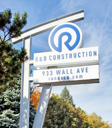
YESCO built, refurbished and then redesigned and rebuilt this sign for R&O Construction.
To achieve this look, YESCO had the customer provide vector versions of the logo. Production Manager Darren Steck said he convened with the customer to discuss the concept first with hand drawings, and then met with them again to confer about colors, playing with multiple revisions of the logo sizes to the name until the client was satisfied.
Substrates included aluminum sheets from Metalwest, steel I-beams from Reliance Steel & Aluminum Co., GE Tetra MAX LEDs, acrylic by Margacipta Wirasentosa, channel letter lighting from Current and Sherwin Williams automotive paint. Equipment used included shears from AccurShear; a brake from Roper Whitney; Miller welders; Milwaukee hand grinders, drills, and sanders; and a MultiCam 304 CNC router.
YESCO ensured R&O Construction’s sign received a proper new beginning. “We realize [some] customers have budgets, and some don’t, [but] we always want their signage to be the best in the industry, giving them the biggest bang for their buck,” Steck said.
RE-ROUTED DESIGN
When tasked with making a sign, the initial design isn’t always attractive. Sometimes though, luck or fate steps in and provides the project with push in the right direction, as was the case for a project assigned to Absolute Sign Inc. (ASI; Los Alamitos, CA) .
According to Director of Operations Tish Scialampo, the CC Tan Center (a luxury living complex in Glendale, CA) sign project was given to them by another shop, which wasn’t able to construct the routed sign the client requested. Initially, ASI was hired to design, fabricate and install the main ID sign, as well as other ancillary signs. But, it turned out that an architect had already designed the primary ID sign for the project and the owner didn’t want to change it.
“It was a terrible, not-well-designed concrete structure and we were not really interested in pouring a big slab of concrete. We tried proposing a different sign to the owner, but he didn’t want to change,” Scialampo said. “As luck would have it, the city hated it [too] and came back to us and asked us to change it, which we did, and the owner actually ended up liking it.”
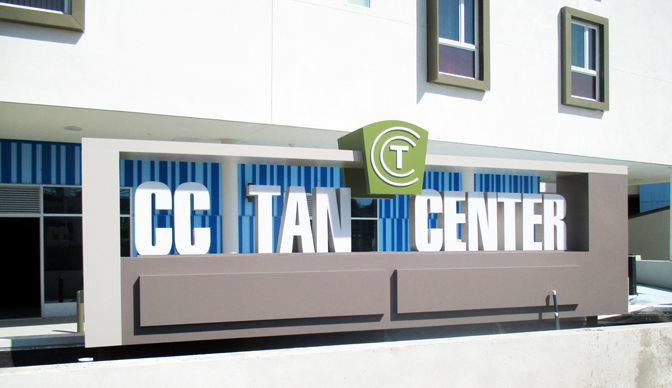
Despite the client’s initial reservations, ASI gained approval on this sign, which was fabricated with the help of a Computerized Cutters router.
The CC Tan Center sign was created with .063-, .080- and .125-in. aluminum, ¾-in. Acrycast acrylic, three different colors of Matthews Paint, GE 24V white LEDs and GE 24V power supplies. For fabrication, ASI got to work with a Computerized Cutters Accu-Cut router, a hand brake, a welder, hand drills, a shear, and both band and circular saws.
Fabrication wasn’t without its hiccups. “The sign was quite large, so the channel letters had to be deep to be proportional with the sign and that presented lighting issues we had to address,” Scialampo said. “It was also a difficult install, as the monument sign was in a planter sitting 4 ft. above grade. It was designed [to be] plate-mounted into the floor of the planter with square tubes running up through the planter and into the sign.”
SLICE OF THE ADIRONDACKS
Jim Thomson, owner of Adirondack Jim’s (Ballston Spa, NY) , describes the act of routing signs as having a “visceral, emotional component as they create a memory into wood.” Thomson loves carving signs from wood so much, that it’s all he does at his one-man shop not far from the very mountains that gave his shop its name.
Because Thomson’s specialty is Adirondack-style exterior signage, it was no surprise when he was approached by a client who had noticed his work on social media, asking for a similarly styled sign and layout for their family cottage, the Coo Coos Nest, nestled in the mountains. The client also requested that the sign blend into the surrounding landscape, incorporate a moose and the unique location of the cottage and hold up through the tough mountain weather.
Adirondack Jim’s makes handcrafted signs, so projects take longer than they would using modern-day machinery. Still, Thomson believes that this old-fashioned way of routing signs also attracts clients to his one-of-a-kind style.
For the Coo Coos Nest cottage sign, Thomson kept the artwork simple, employing no design software and using drawings of simple wild animals and silhouettes to mark the cabin’s location. “The sign was one in which the customer knew the feel they wanted and trusted Adirondack Jim’s to capture [it],” Thomson said.
When choosing materials, Thomson used select grade, clear, western red cedar 2 x 6-in. planks, which were jointed and glue-laminated into a solid sign panel. He finished the background with an industrial black spray ink by Marsh and sealed it with McCloskey’s Satin Spar Varnish, while the wood trim, text and art were sealed with Sikkens Proluxe modified oil sealant in the natural tone. The artwork layout was traced over carbon paper after the layout lines and center were established.
Jim Thomson of Adirondack Jim’s created a sign for the Coo Coos Nest using premium western cedar and implementing the shop’s signature relief carving.
For routing the wood, Thomson only uses Whiteside Solid Carbide router bits because they are American-made, razor-sharp and perform under very demanding conditions. His choice of routers is the Makita RF1101 2.25-hp combination router. “It’s the only router that has been able to stand up to demanding carving year after year,” Thomson said. “It’s the Lexus of routers, in my opinion.”
Although the sign was relatively easy to lay out, the addition of the moose led to carving challenges, as the fine detail in the antlers could have easily broken during the high-speed routing. To work around that issue, the depth of the antlers was reduced to ¼ in. instead of ⅜ in. Thomson then used a solid carbide profile bit to outline the antlers, followed by a 1/16-in. straight bit and finally a ⅛-in. upcut spiral bit to give the antlers a raised look while still being strong enough to hold up to carving in the adjacent area.
“If you can innovate your own style to capture textures and themes, you will always have customers. It took several years for Adirondack Jim’s to create a one-of-a-kind style,” Thomson said. “There are really no tricks or magic to hard work, persistence and passion. Those elements create the product in the sign market.”
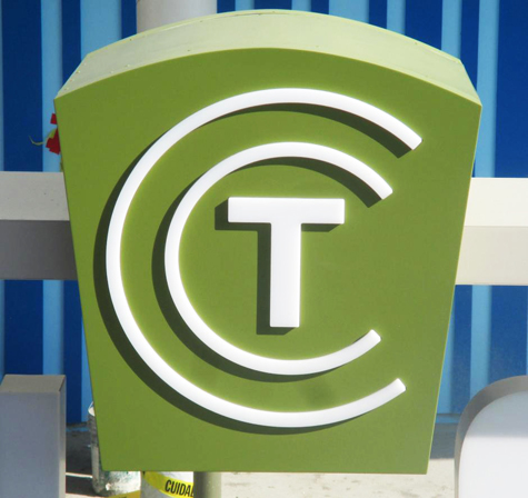
ASI used CorelDRAW and Adobe Illustrator to design a logo for the client.
