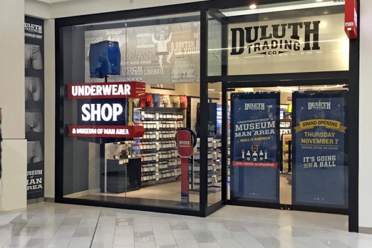
Duluth Trading Company has always been one to take risks when it comes to their marketing and advertising. “Buck,” their famous – or infamous – half-naked underwear model has proved to be a key character in their marketing strategy. So much so, that Duluth Trading Co.’s underwear is their hottest selling item. Thus, the folks at Duluth decided to strike while the underwear iron is hot by opening a new concept store in the Mall of America (MOA; Bloomington, MN). This store would solely feature men’s underwear.
RETRO SLEEK
We (Sign Art Studio; Mount Horeb, WI ) met with the creative and store-planning leadership to review their concepts. The design intent, “The Museum of Man,” doesn’t sound fun at all, right? Joking, of course, this idea immediately propelled my design brain into overload. We reviewed some images they found online and the store layout. DTC’s creative department gave us free reign to come up with some options. Virtually no design parameters at all, other than it needed to say “UNDERWEAR SHOP, Museum of Man.” However, we did face MOA’s rather strict signage guidelines, including “no blinking, no rotating, no neon, no, no, no…” for all primary signage installed on store exterior façades.
I set to work on the plan. Duluth’s creative team had mentioned they wanted “old, yet modern,” so I knew right away that a design that harkened back to the Mad Men era, but sleek with modern execution, was in order. Knowing that MOA’s façade guidelines were too tight to pull off the first ideas I had in mind, I figured we could cheat the system at little and design the “primary” sign to reside just inside the interior space, freeing us up to skirt the guidelines.
This is where the design fun began. I pulled out one of my favorite reference books, Atkinson Reproduced in Color, (now out of print) compiled by Signs of the Times’ then-Publisher Tod Swormstedt, and released in 1994. After flipping through a few pages, I set to work on a two-sided, projecting-style sign, easily viewed from the exterior. The star of the design was to be an oversized bust of the under-wear, mounted on a rotator. And since this sign would be close to customers, LED internal illumination (not neon) was the way to go. I landed on push-through acrylic for all lettering as well as column elements gilded with 23k goldleaf. The last, little touch included freehand, inset pinstripes on all panel faces. I fired off the designs with multiple colorways to Duluth. Their creative department loved it, so we detailed all finishes and lighting plans. We settled on a high-gloss finish to emulate old, porcelain enamel signs. All text would be backlit, and I proposed to have a hidden light from the ceiling spotlight the rotating underwear. After all, the underwear really is the star of this show!
BUSTIN’ OUT THE CHAINSAW
During our production handoff meeting, we looked at producing this sign in a way we hadn’t done before. Historically, we’d use aluminum angle framing cladded with aluminum. Instead of angle, we decided to cut all flanges on our CNC, then weld returns to the flanges. Basically, we produced the angle frame like a reverse-formed aluminum channel letter. The hope was for a better fit of the faces and side panels, and to allow the CNC to work more of the minutia. We decided on 1-in.-thick, white acrylic for the push-through lettering and white SloanLED Prism Mini modules for the illumination. We specified 15-lb. Sign·Foam4 HDU for the underwear bust to sit atop a Dynapac Rotator. All cabinets were set for Matthews Paint as a base, followed by SMART Clear automotive clear coat.
Kirk Crawford, our resident sign wizard, handled all CNC operations on this project. He truly has our 5 x 10-ft. MultiCam APEX3R under his spell. The serif-style letters proved a bit of a challenge when it came to tolerances, but he conjured excellent results. After all parts were cut, our fabrication team took over on the cabinet sections. Callie Palan, our lead fabricator, dug in on the framing. We quickly realized that our plan for the framing presented some warping challenges over our usual angle-frame process. We hoped we would see a wash later with the panel fitting better, and to a degree, we did.
Kirk then attacked the underwear bust. He glued up several blocks of Signfoam using Reynolds Advanced URE-BOND 90 and mounted a few patterns to get his rough-ins marked, then wielded an electric chainsaw for the rough cuts. From there, he refined the shape with grinders and sanders.
BUCK TRUTH
In the meantime, it was time to paint. All parts were prepped and moved into our Garmat semi downdraft paint booth. We used Matthews Epoxy Primer for the underwear bust and their etch primer for the aluminum cabinets. After the color was sprayed, we buried everything in automotive clear. While the parts were curing, we gilded the column details using Dukate Double Gold. The team started on wiring and assembly while the faces received their freehand pinstripes. Assembly went relatively trouble-free but for a few fitting hurdles with the push-through letters. Those darn serifs!
Lastly, I don’t know about other shops, but when our team reaches final assembly on a special project like this, something magical happens. It didn’t matter that it was 4 p.m. on Friday; everyone wanted to see the switch flipped on this one. The beers or weekend plans that were calling weren’t calling loud enough. Office and shop staff gathered around, the shop lights were killed and the switch on the sign was flipped on. The LED lights came to life and the underwear bust started to rotate. We stood there with the smiles on our faces, shared high fives and asked each other, once again, was this our best sign yet? We think so.
EQUIPMENT AND SUPPLIES
Router: MultiCam APEX3R 5 x 10 ft., multicam.com
Software: Adobe Illustrator (with Hot Door CADtools), adobe.com and hotdoor.com; SAi EnRoute (router), thinksai.com
Substrates: 2002 and 5052 .125 aluminum sheets and 3 x 3 x .125-in. steel square tube from Wisconsin Metals, wimetals.com; white translucent acrylic, 1 in. thick from Laird Plastics, lairdplastics.com; Sign·Foam4 15-lb., 2-in. HDU, signfoam.com; Reynolds Advanced Materials URE-BOND 90, reynoldsam.com
Coatings: Matthews Paint epoxy primer and etch primer, matthewspaint.com; 1Shot Lettering Enamel, 1shot.com; SMART Clear automotive clear coat, finishmaster.com; Dukate Double 23k goldleaf from Art Essentials, artessentialsofnewyork.com
Lighting: SloanLED Prism Mini White modules, sloanled.com
Rotator: Dynapac Rotator, dynapacrotating.com
